Sur is a company that merges farming and science to develop innovative, plant-based supplements designed to enhance athletic performance. Guided by a science-driven approach, they create products that support individuals in reaching their fitness and wellness goals.
The ask: Develop a distinct brand identity to help Sur stand out in the competitive supplement market, launch their first B2C product, called AltRed, explain the complicated science behind the product in a simple and digestible way, and create strategies to connect with and build lasting relationships with their target audience—dedicated athletes.
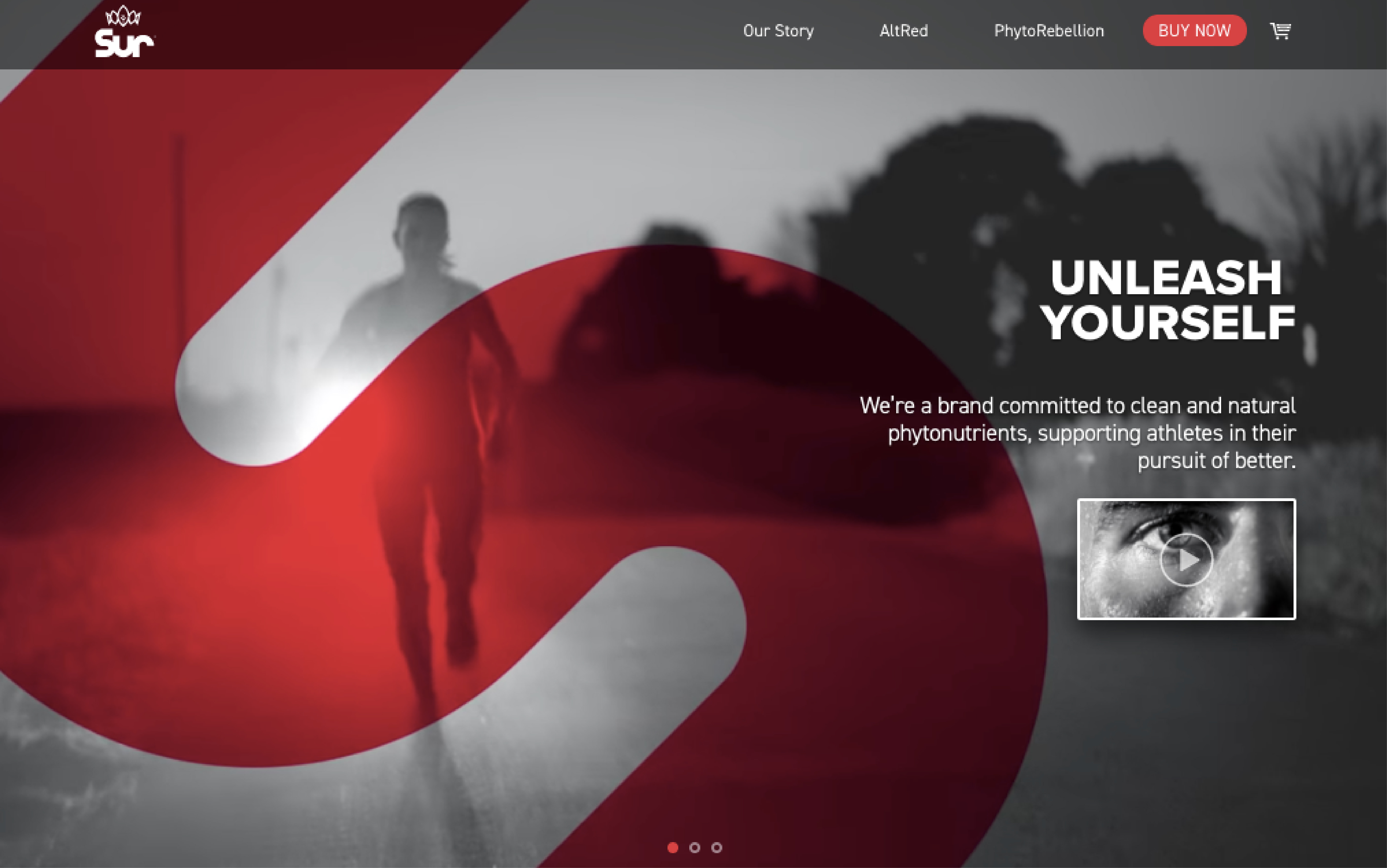
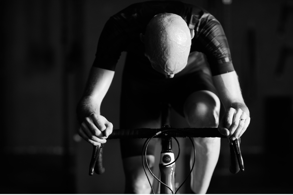
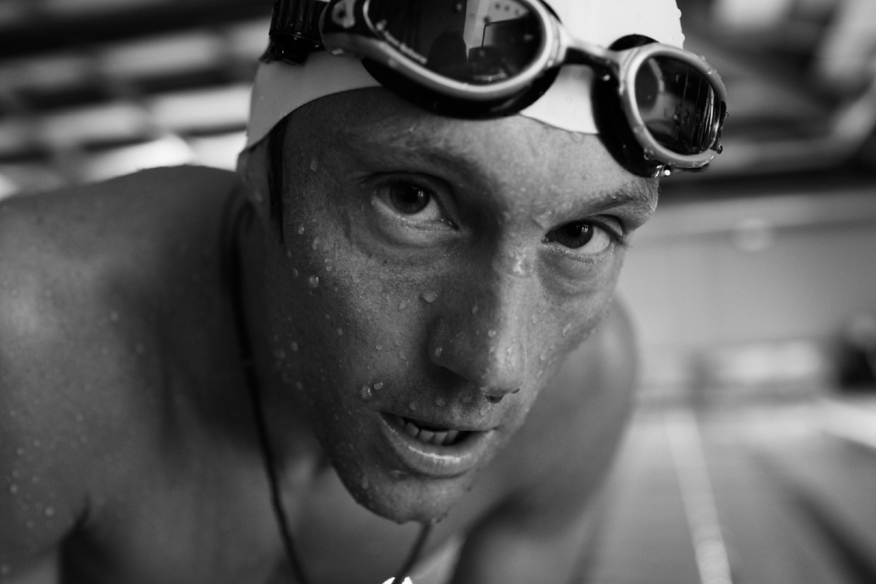
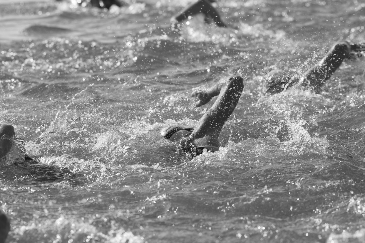
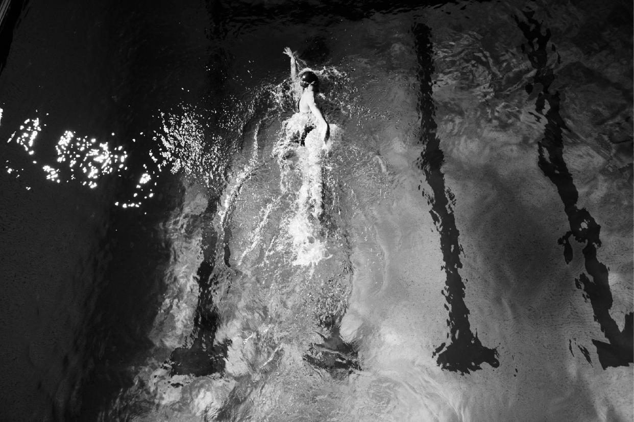
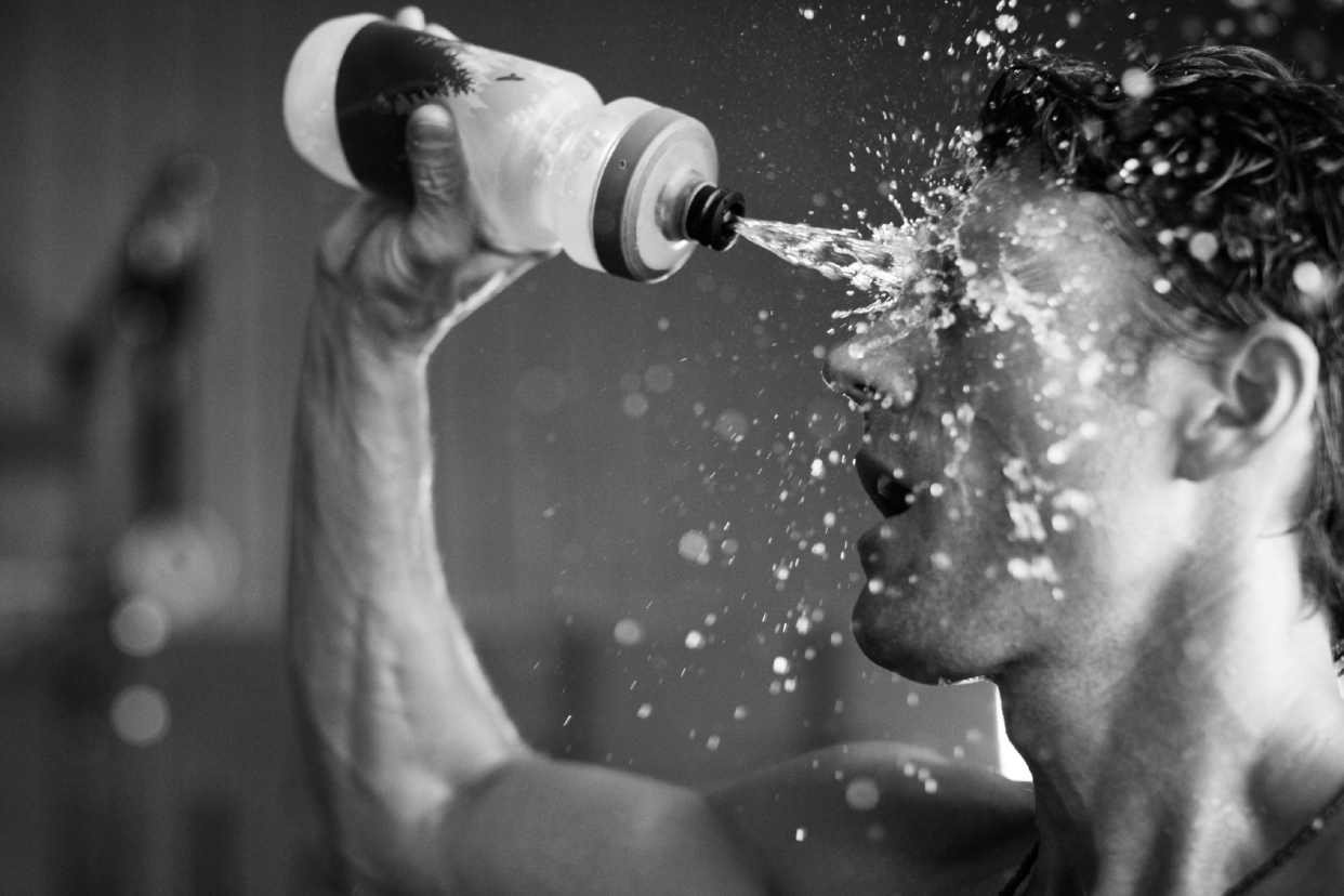
The solution: The goal was to reposition the company as an athletic performance brand rather than a typical supplement company. By shifting both the tone and visual identity with this perspective, we aimed to better connect with the target audience. To support the rebrand, an online commercial was produced to showcase the new identity. As a design intern, I assisted the Creative Director with various tasks including logo exploration for the master brand, developing assets for the website, and serving as a production assistant during a two-day commercial shoot.
Sur is a company that merges farming and science to develop innovative, plant-based supplements designed to enhance athletic performance. Guided by a science-driven approach, they create products that support individuals in reaching their fitness and wellness goals.
The ask: Develop a distinct brand identity to help Sur stand out in the competitive supplement market, launch their first B2C product, called AltRed, explain the complicated science behind the product in a simple and digestible way, and create strategies to connect with and build lasting relationships with their target audience—dedicated athletes.
The solution: The goal was to reposition the company as an athletic performance brand rather than a typical supplement company. By shifting both the tone and visual identity with this perspective, we aimed to better connect with the target audience. To support the rebrand, an online commercial was produced to showcase the new identity. As a design intern, I assisted the Creative Director with various tasks including logo exploration for the master brand, developing assets for the website, and serving as a production assistant during a two-day commercial shoot.


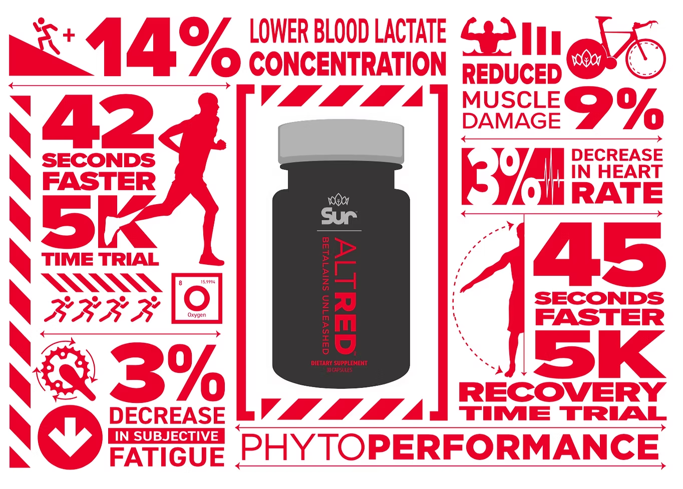
To simplify the science behind AltRed and make it more digestible for a broader audience, we designed an infographic that transforms complex data into clean iconography and structured visual flow. Its bold, poster-like aesthetic not only reinforces the brand’s graphic identity but also makes the information feel more approachable and compelling.