Grainful is a food brand, based out of Ithaca NY, that offers frozen meals made with wholesome, hearty grains like steel-cut oats, quinoa, and brown rice. Their products focus on delivering nutritious, convenient, and flavorful meals, often featuring globally inspired recipes. Grainful emphasizes clean ingredients as they are gluten free, non-GMO, whole grain, and high in fiber; capitalizing on the explosive growth of consumer and retailer trends toward healthful, nutritional and natural foods.
The ask: Grainful needed a rebrand to better compete in the crowded frozen meals category and expand its retail presence. Given the challenging visibility within the frozen aisle, creating a bold and distinctive look was essential to help the brand stand out.
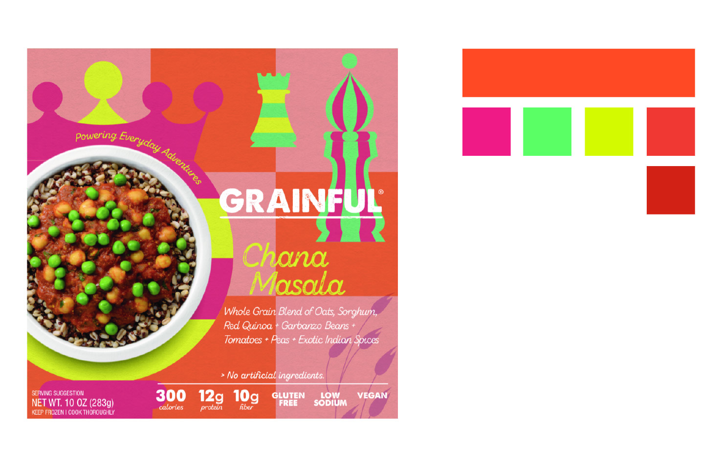
The solution: "Powering Everyday Adventure" became the central idea to the brand. With this in mind, Love & The Machine was able to express and create specific stories per flavor about an everyday adventure. This was reflected in the packaging designs' illustrations and color. By each flavor telling a story, it felt just as personal and friendly as the company Grainful is. As the graphic designer, I was responsible for executing the packaging layouts based on concepts developed by the creative director. I also designed social media content for the brand, making sure it reflected the new rebrand.
Grainful is a food brand, based out of Ithaca NY, that offers frozen meals made with wholesome, hearty grains like steel-cut oats, quinoa, and brown rice. Their products focus on delivering nutritious, convenient, and flavorful meals, often featuring globally inspired recipes. Grainful emphasizes clean ingredients as they are gluten free, non-GMO, whole grain, and high in fiber; capitalizing on the explosive growth of consumer and retailer trends toward healthful, nutritional and natural foods.
The ask: Grainful needed a rebrand to better compete in the crowded frozen meals category and expand its retail presence. Given the challenging visibility within the frozen aisle, creating a bold and distinctive look was essential to help the brand stand out.
The solution: "Powering Everyday Adventure" became the central idea to the brand. With this in mind, Love & The Machine was able to express and create specific stories per flavor about an everyday adventure. This was reflected in the packaging designs' illustrations and color. By each flavor telling a story, it felt just as personal and friendly as the company Grainful is. As the graphic designer, I was responsible for executing the packaging layouts based on concepts developed by the creative director. I also designed social media content for the brand, making sure it reflected the new rebrand.
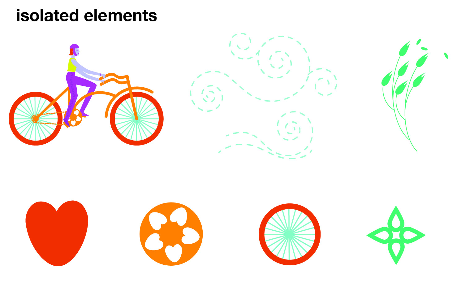
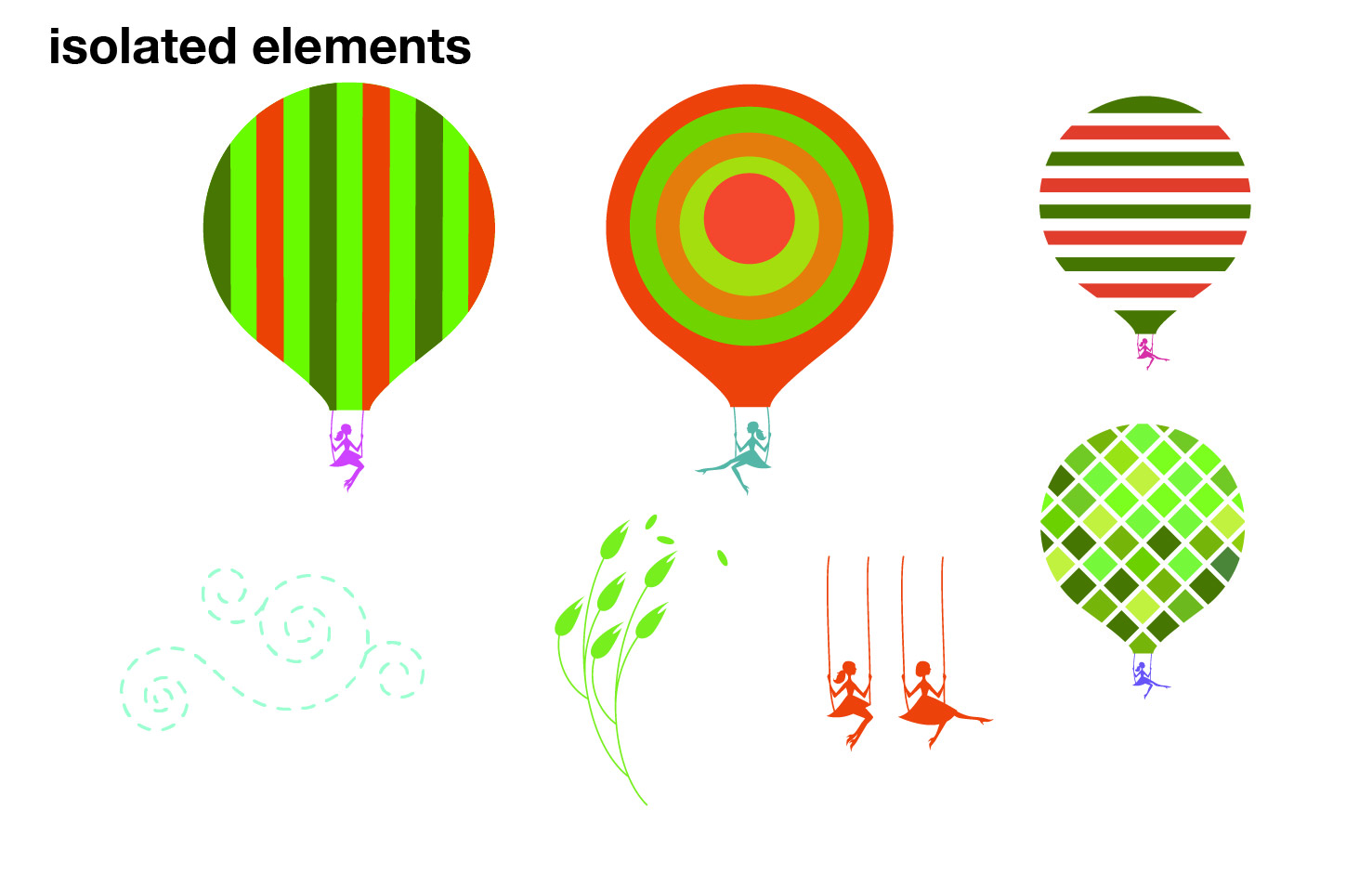
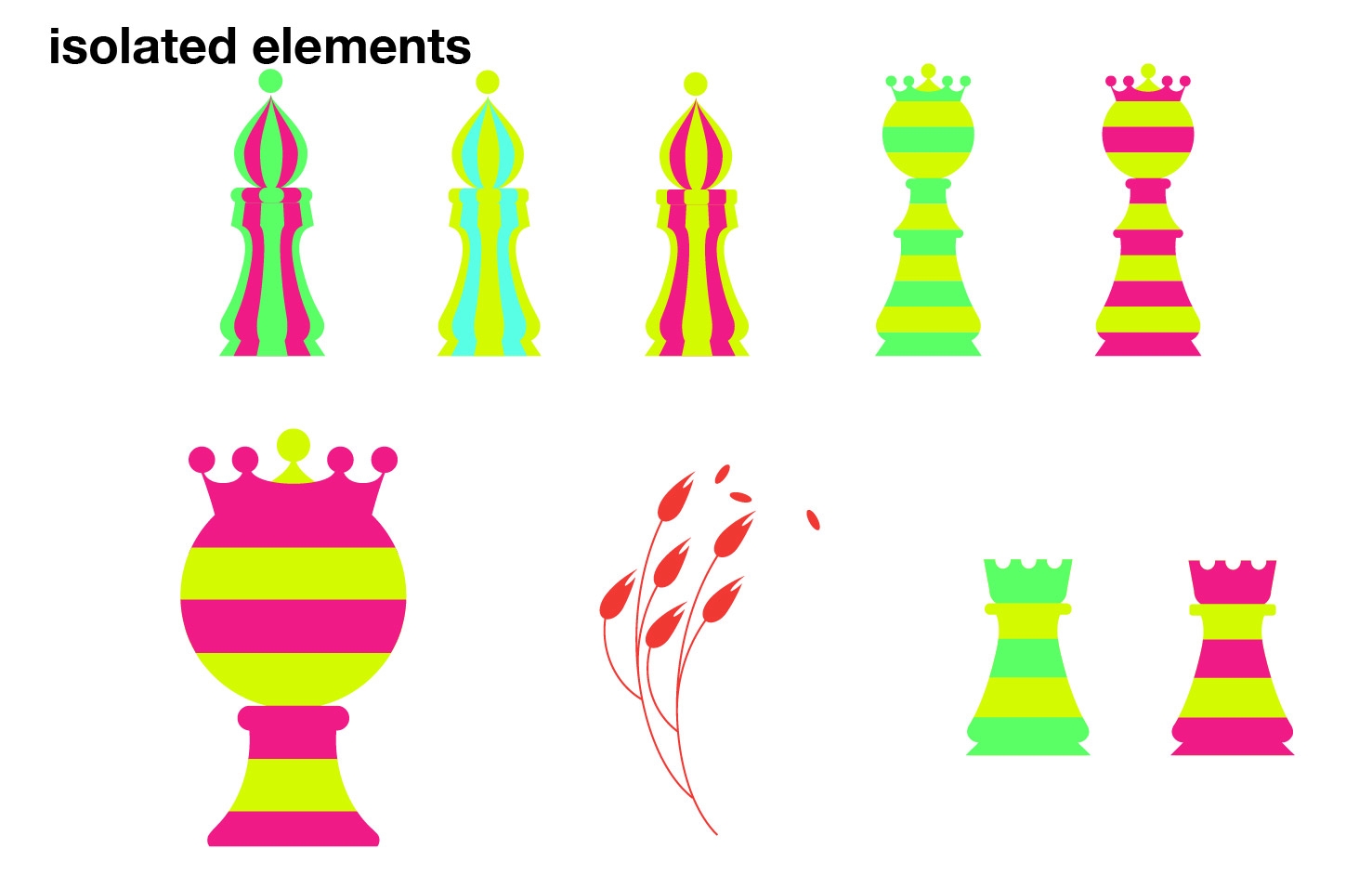
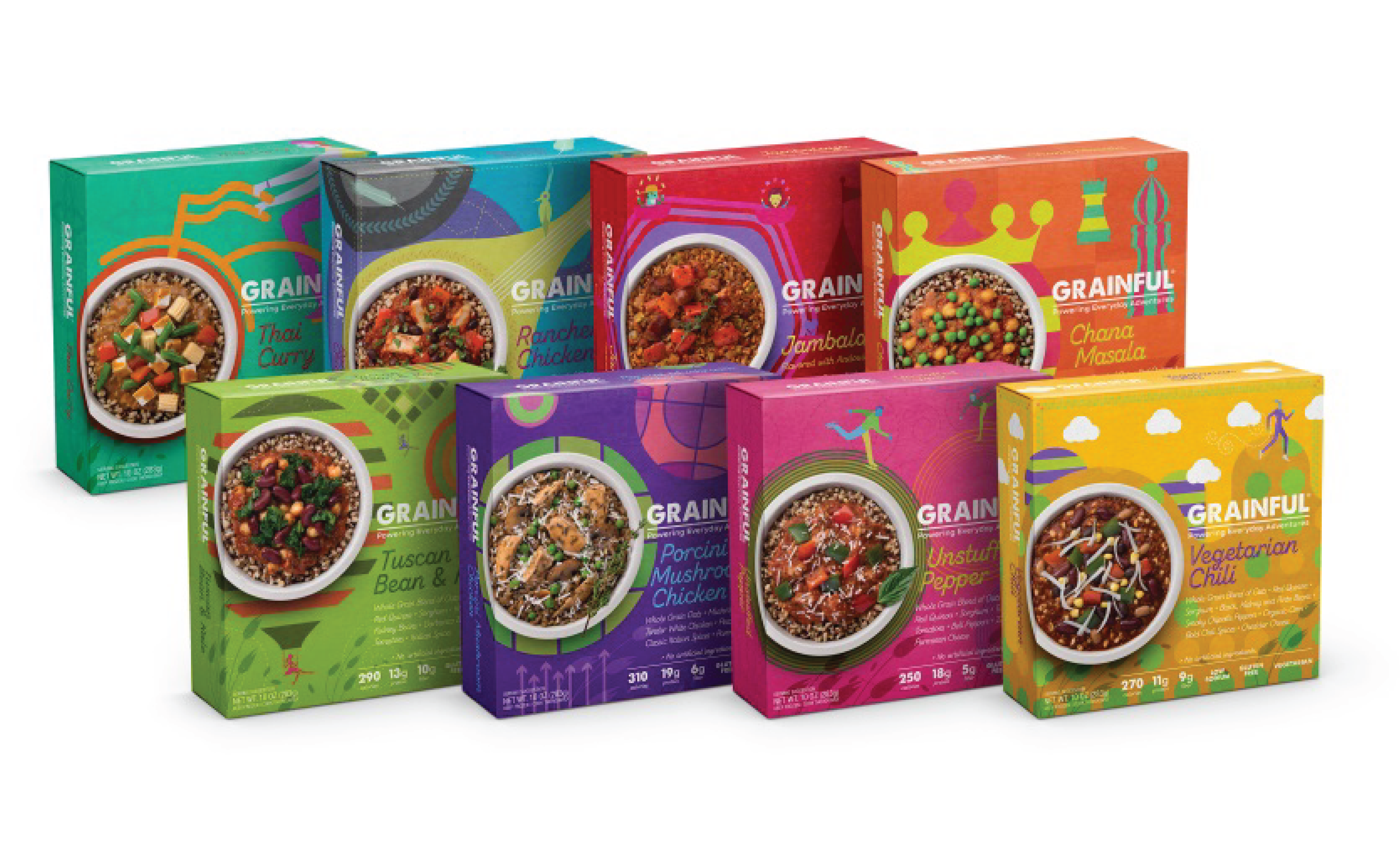
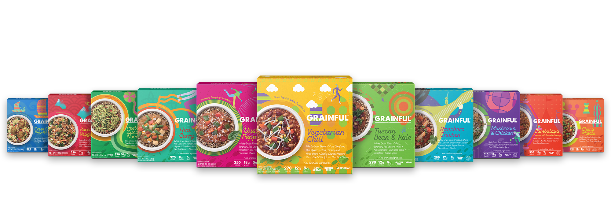
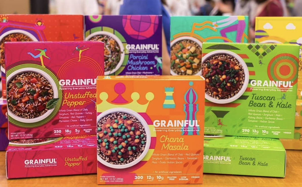
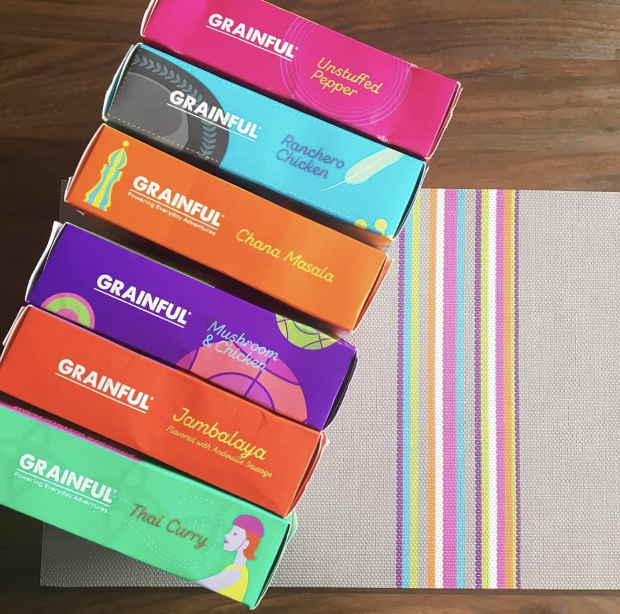
Different packaging variations were created for each flavor, with each one featuring its own color palette and design elements that visually tell a story connected to the flavor. All designs remained aligned with the brand’s core message of “Powering Everyday Adventure.”
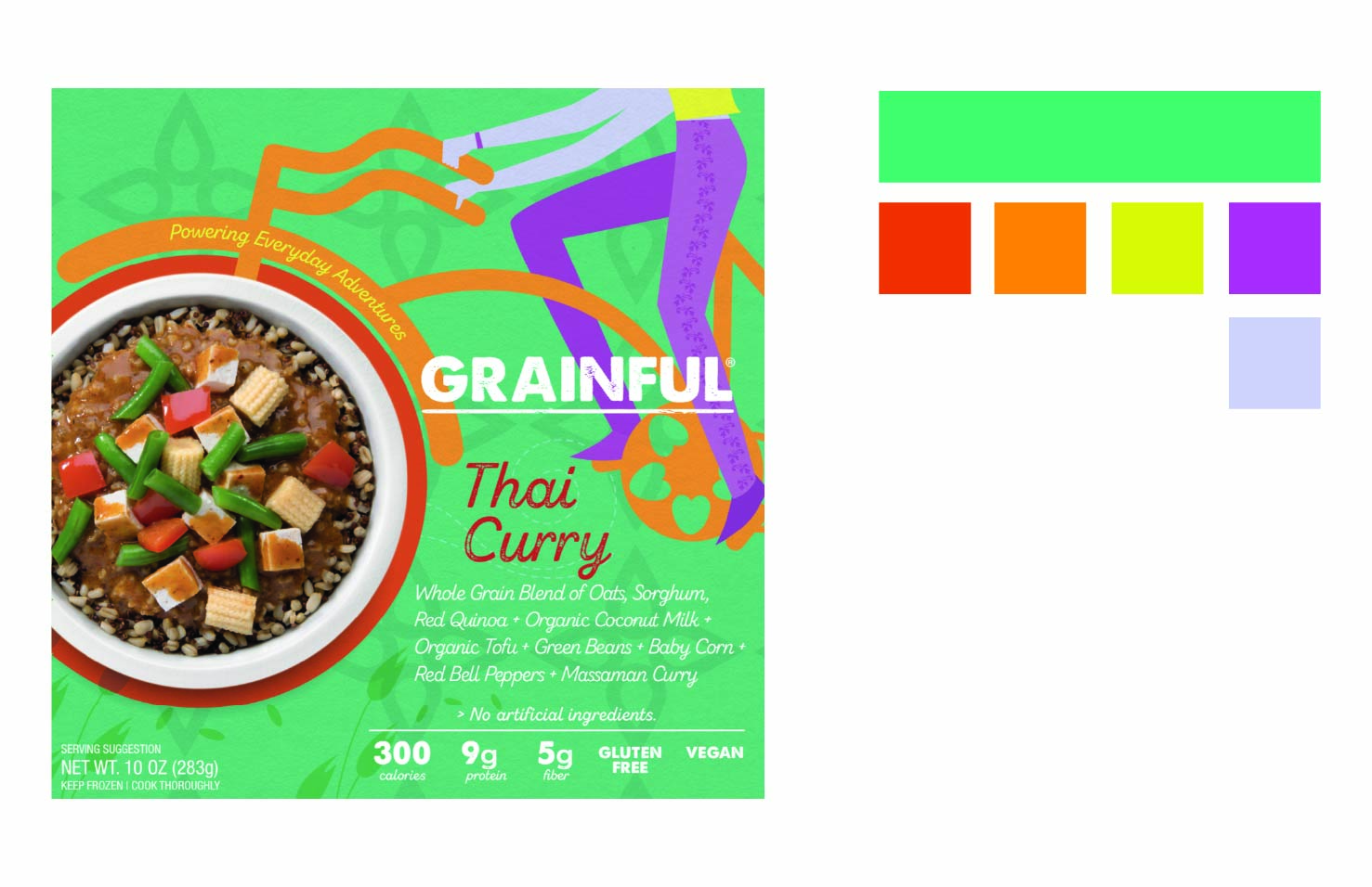




Before the rebrand, Grainful had a traditional frozen meals look commonly seen in stores. Its generic appearance made it difficult to stand out in the crowded frozen food aisle.

Inspired by the idea of "Powering Everyday Adventure," the new Grainful packaging features bright, vibrant colors and illustrations that give each flavor its own distinct personality. Every box tells a visual story, making the product more engaging and memorable. This rebrand helps the packaging pop on shelf and compete more effectively in a crowded market.
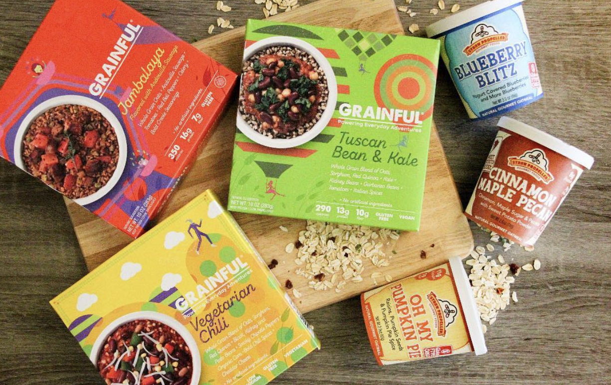


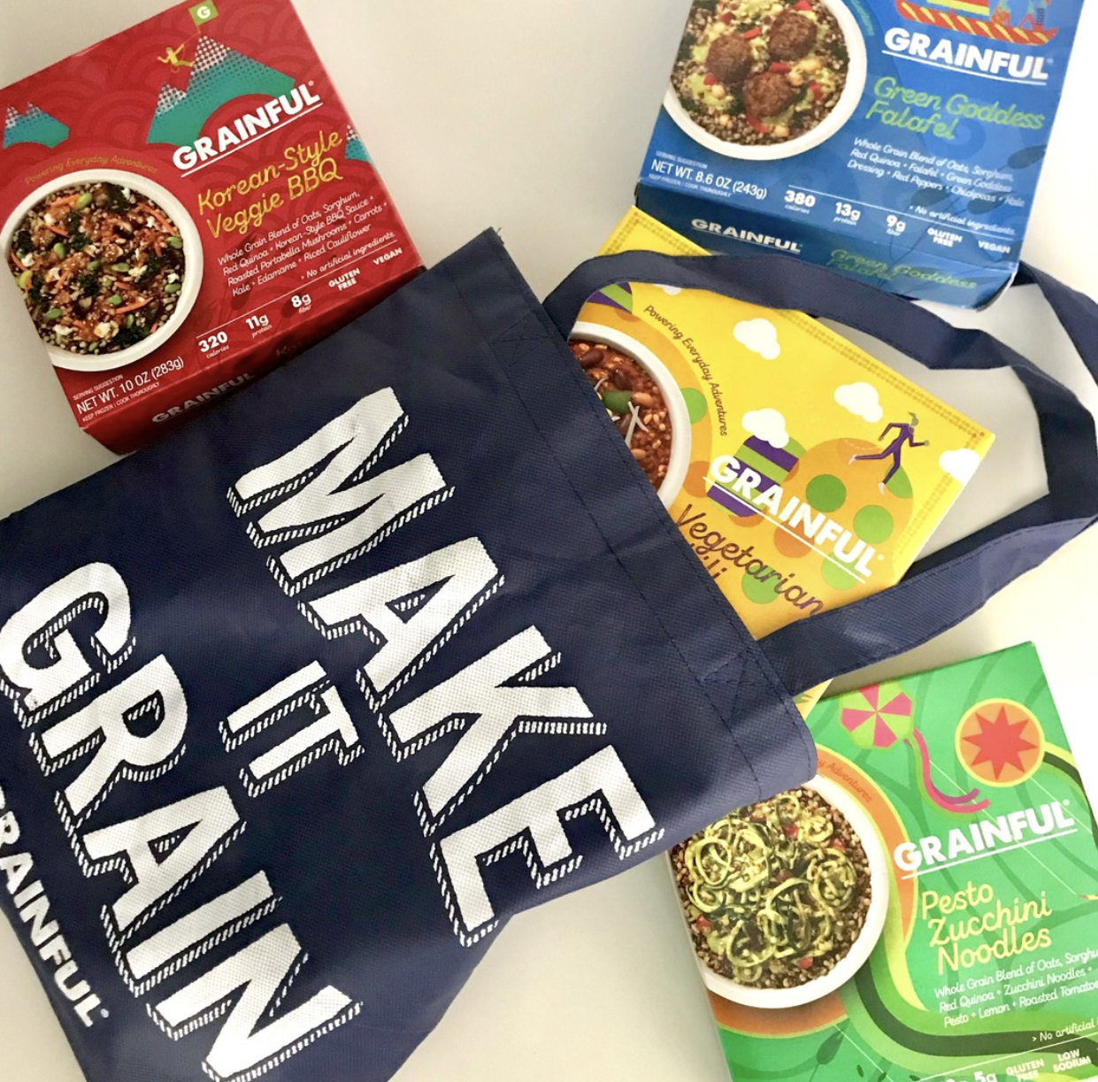

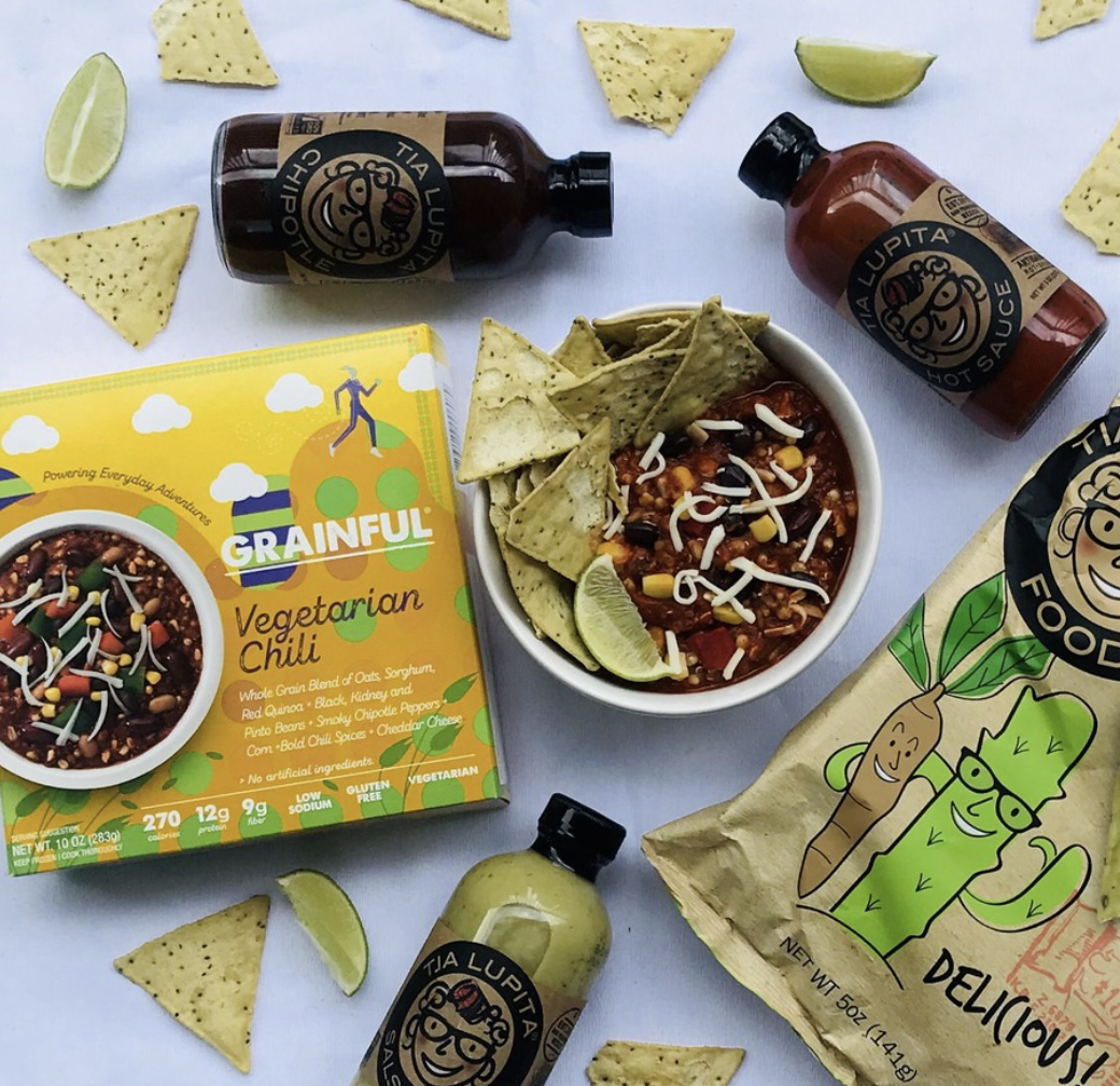
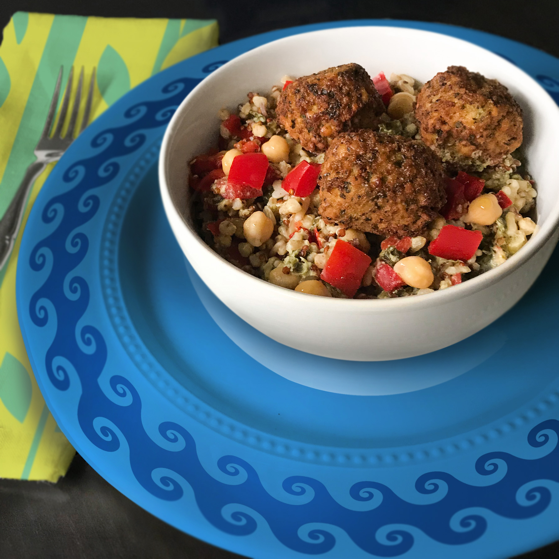
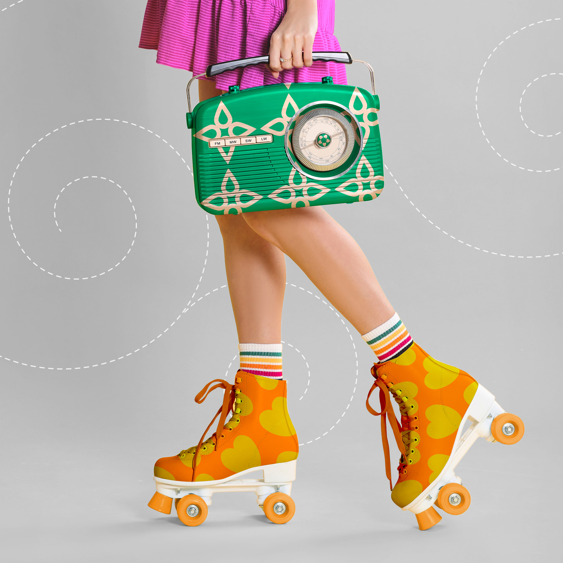
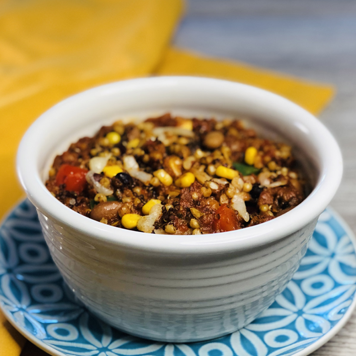
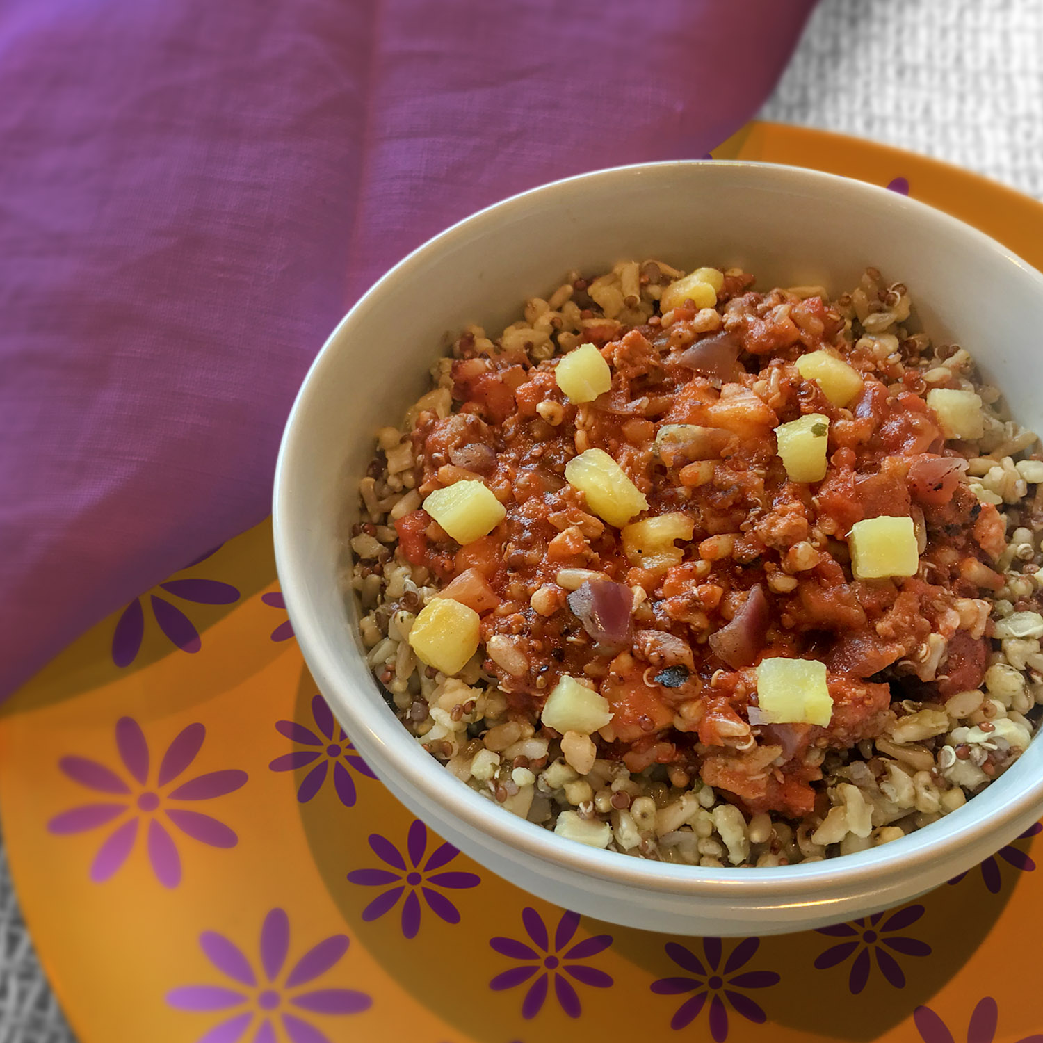
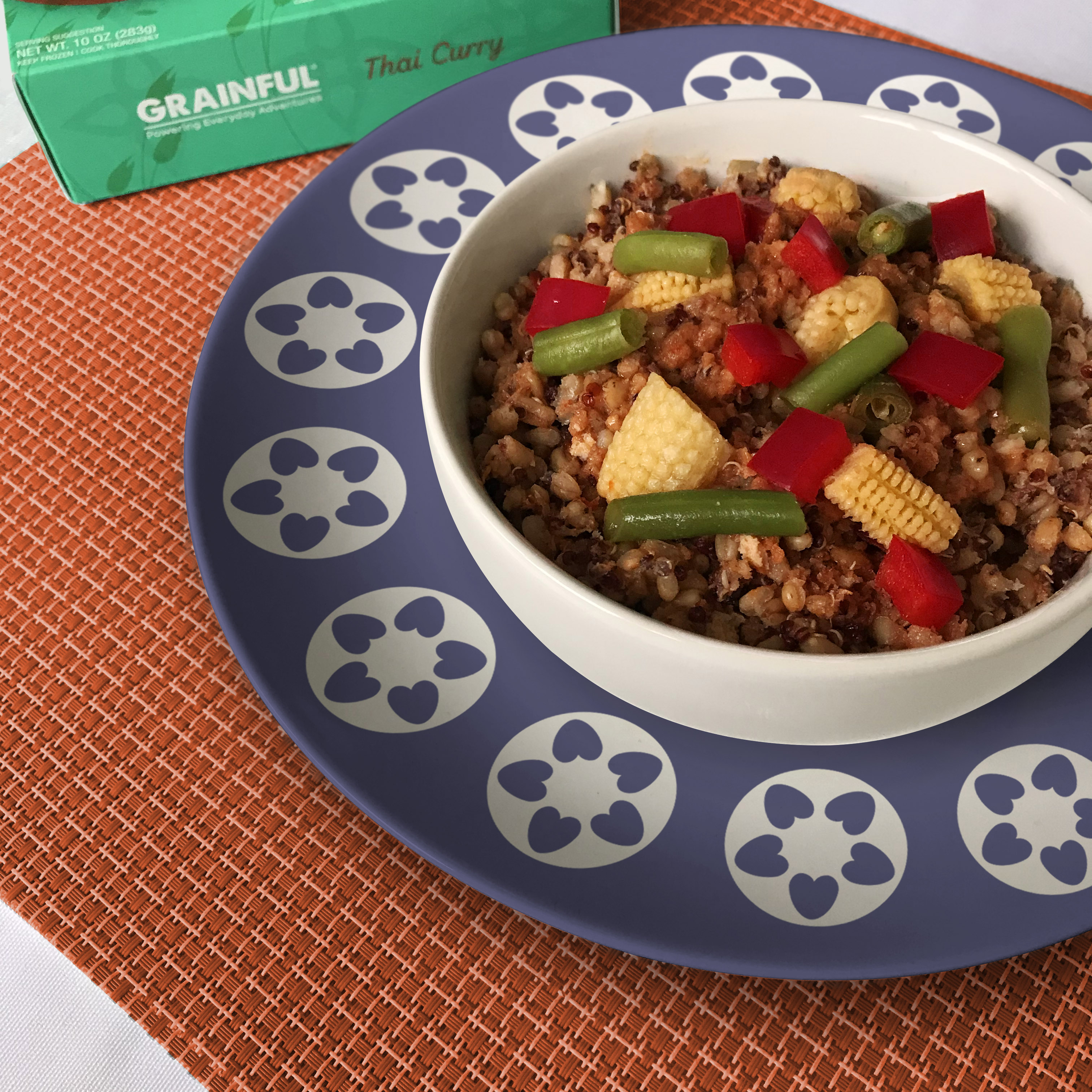
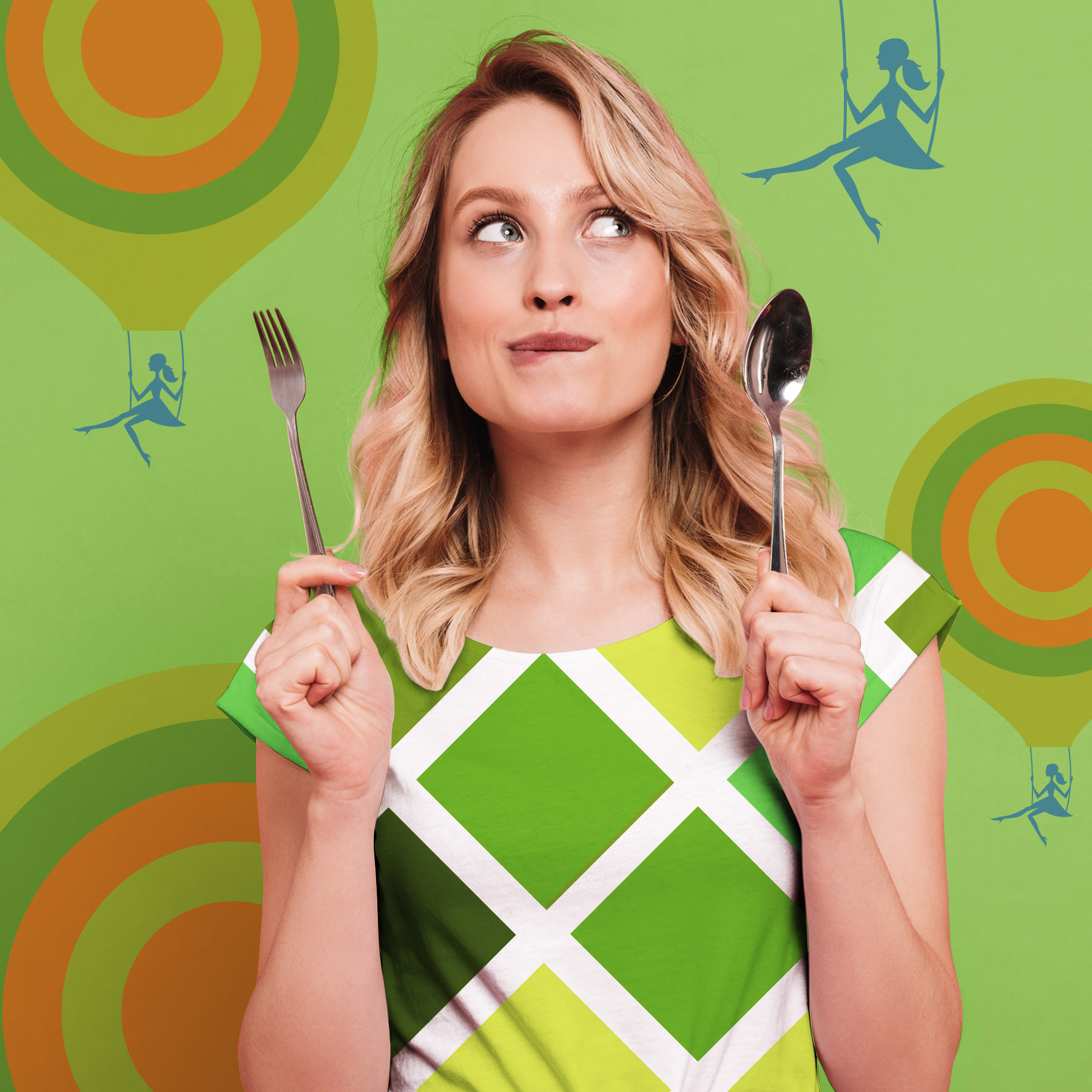
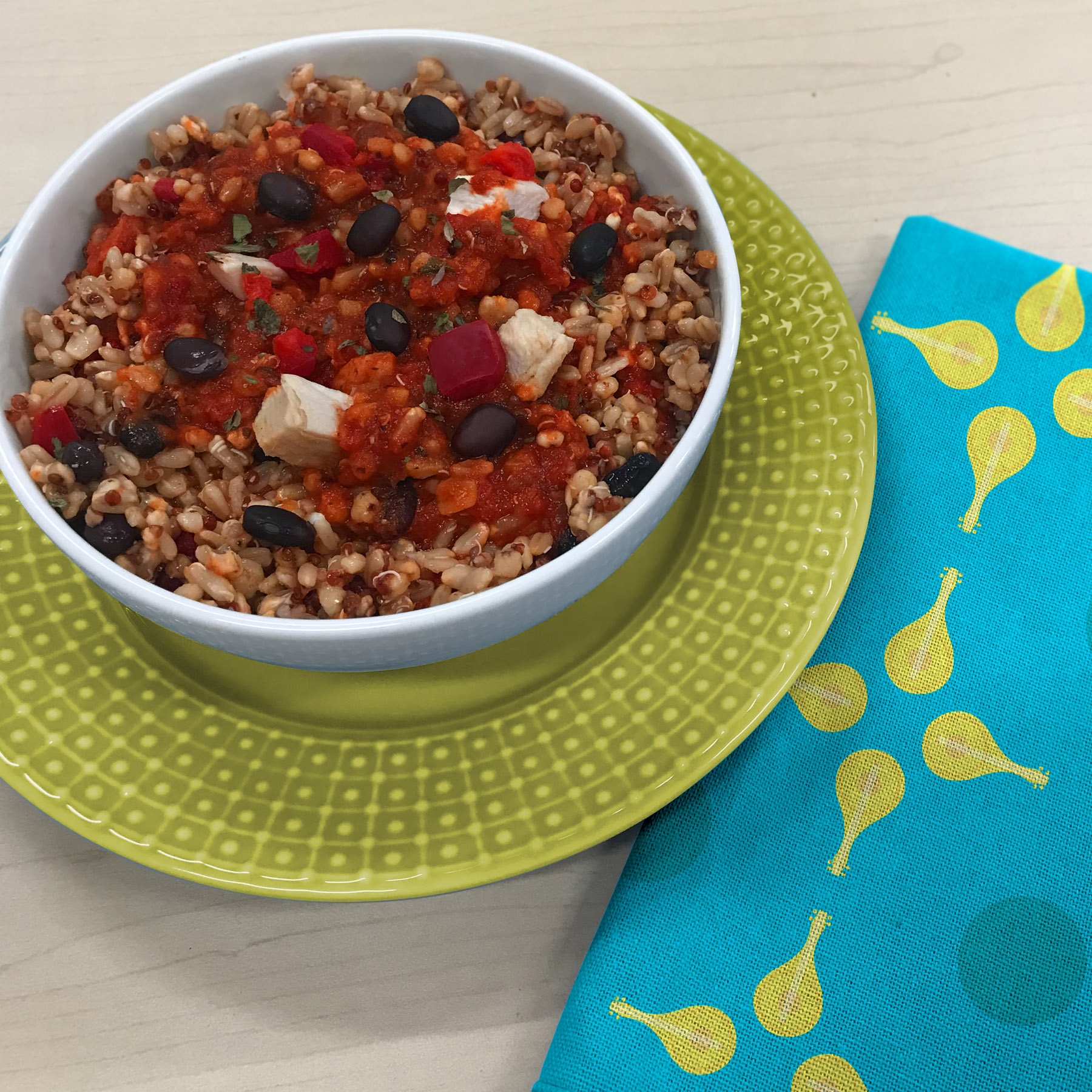
As part of Grainful's rebrand, the social media content was refreshed to reflect the brand’s core theme of “Powering Everyday Adventure." A detailed style guide was created in order to achieve that. The content strategy included lifestyle imagery, illustrations, doodles, and GIFs. Weekly designs were created to achieve this. Check out Grainful's Instagram page here.